
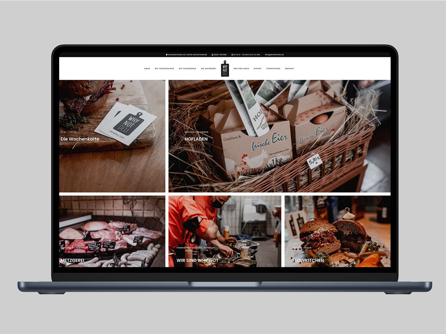
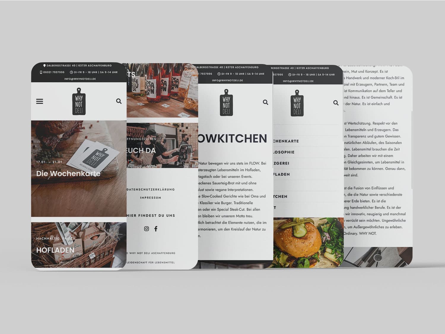
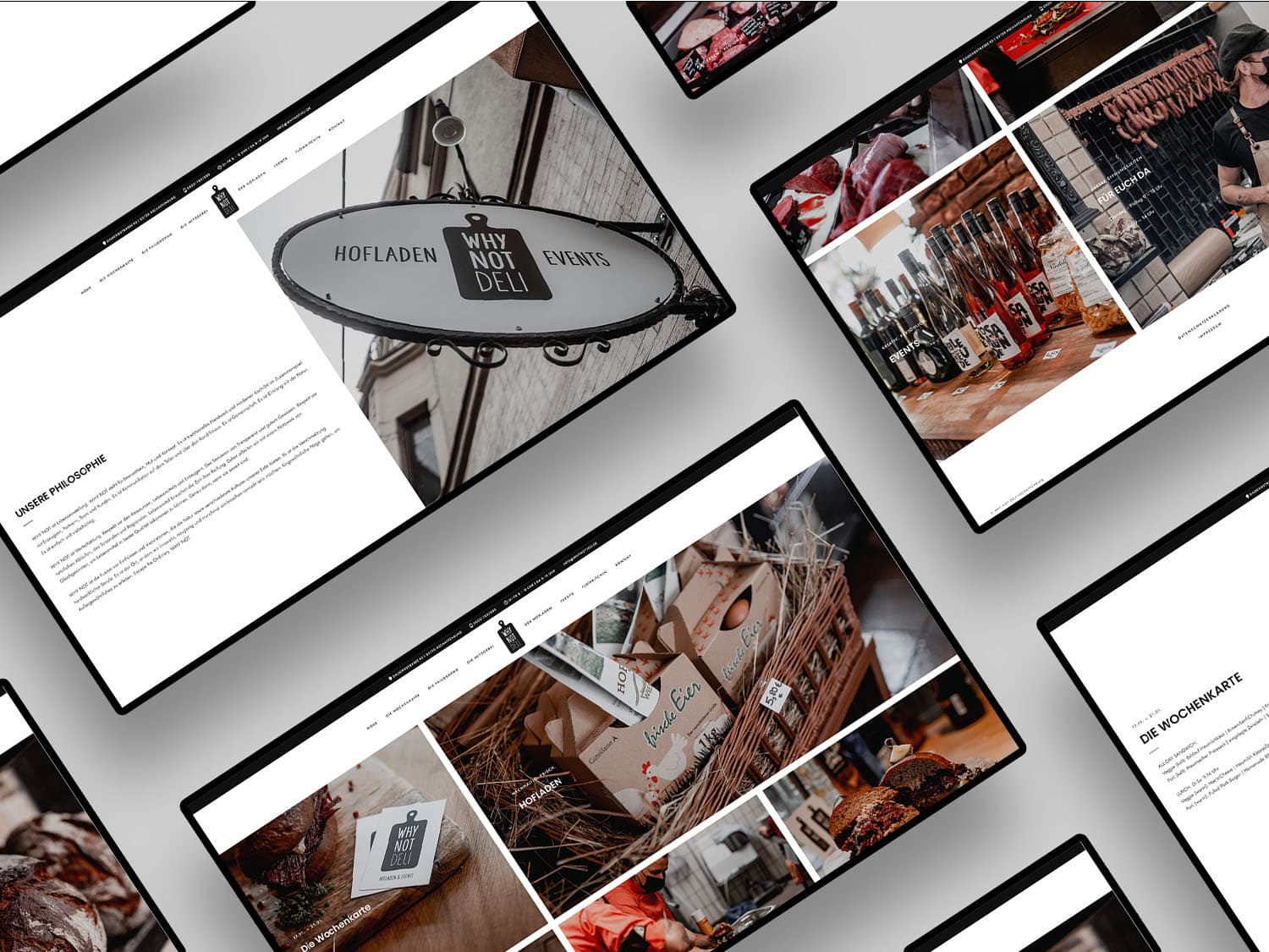
The result is a user-friendly website that reflects Why Not Deli's corporate image and enables the company to advertise and sell online.
Even though an image website is relatively easy to design, the underlying functions and the purpose of the site should not be lost sight of.
A representative image page, clearly and modernly implemented.
A delicatessen lives on things that are hard to put into text: the selection, the quality, the way customers are advised. Building a website for a business like that is a translation job. The impression the shop makes in person has to find an equivalent on screen, without turning into a catalogue nobody maintains.
Then there is the question of what the website is actually for. For a business with a fixed location, the most common visit is not a purchase but a quick check: what is on offer, where it is, when it is open, how to reach somebody. Those visits help decide whether a person makes the trip to the shop at all.
An image website is quick to put together visually, and that is precisely the risk. It looks finished before anyone has settled which jobs it is supposed to do in the company's daily routine. That question belongs at the start, not at the end.
The result is a website that reflects the company's image while giving the business a way to advertise and sell online. Combining the two in one site is less obvious than it sounds. Pure image presentation leads visitors to no action at all. A pure sales page leaves out exactly what distinguishes a delicatessen from any other supplier.
The consequence is a clear order of priority on every page: impression first, then information, then the route to an action. Images carry most of that weight, but they need editorial direction. Otherwise what appears is a gallery that explains nothing.
User-friendly in this context mainly means few levels, understandable labels and no hunting for the obvious. Somebody who wants to know what the shop offers should not have to work through a menu structure built for a far larger range.
The harder part of an image website begins after launch. A business changes: the range moves on, occasions come and go, opening times shift. A site that does not follow those changes loses credibility within a few months, usually without anyone noticing.
Maintainability is therefore a decision made early. It should be clear which content gets touched regularly and who does it. Anything that requires design skills will not be updated in practice.
Second, local findability counts. For a business with a fixed location, a large share of visitors arrive through searches tied to a place and an occasion. Address, contact details and what is on offer therefore have to be unambiguous and sit somewhere people find without a detour.
Third, images age faster than text. Photos showing a season or an interior that no longer exists work against a site more strongly than an outdated sentence does.
Write to us or book an initial consultation directly. We reply within 24 hours, usually faster on weekdays.