
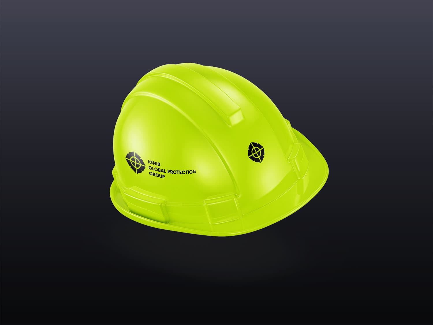
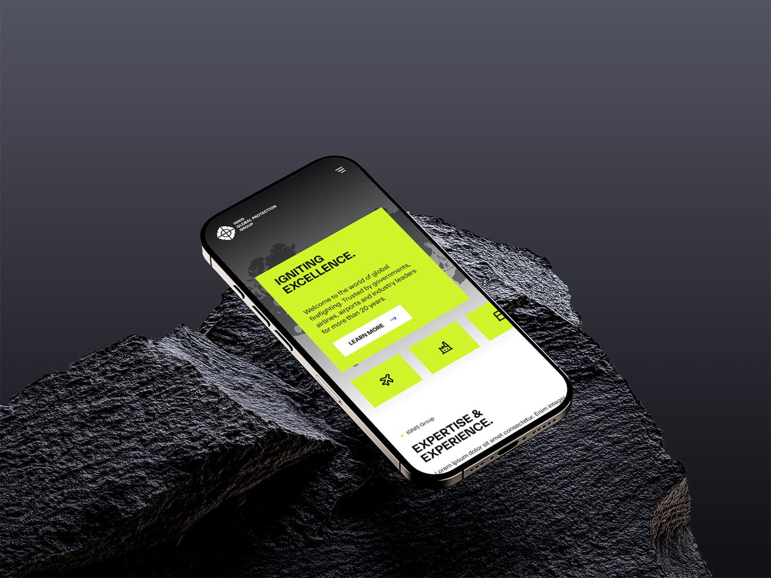
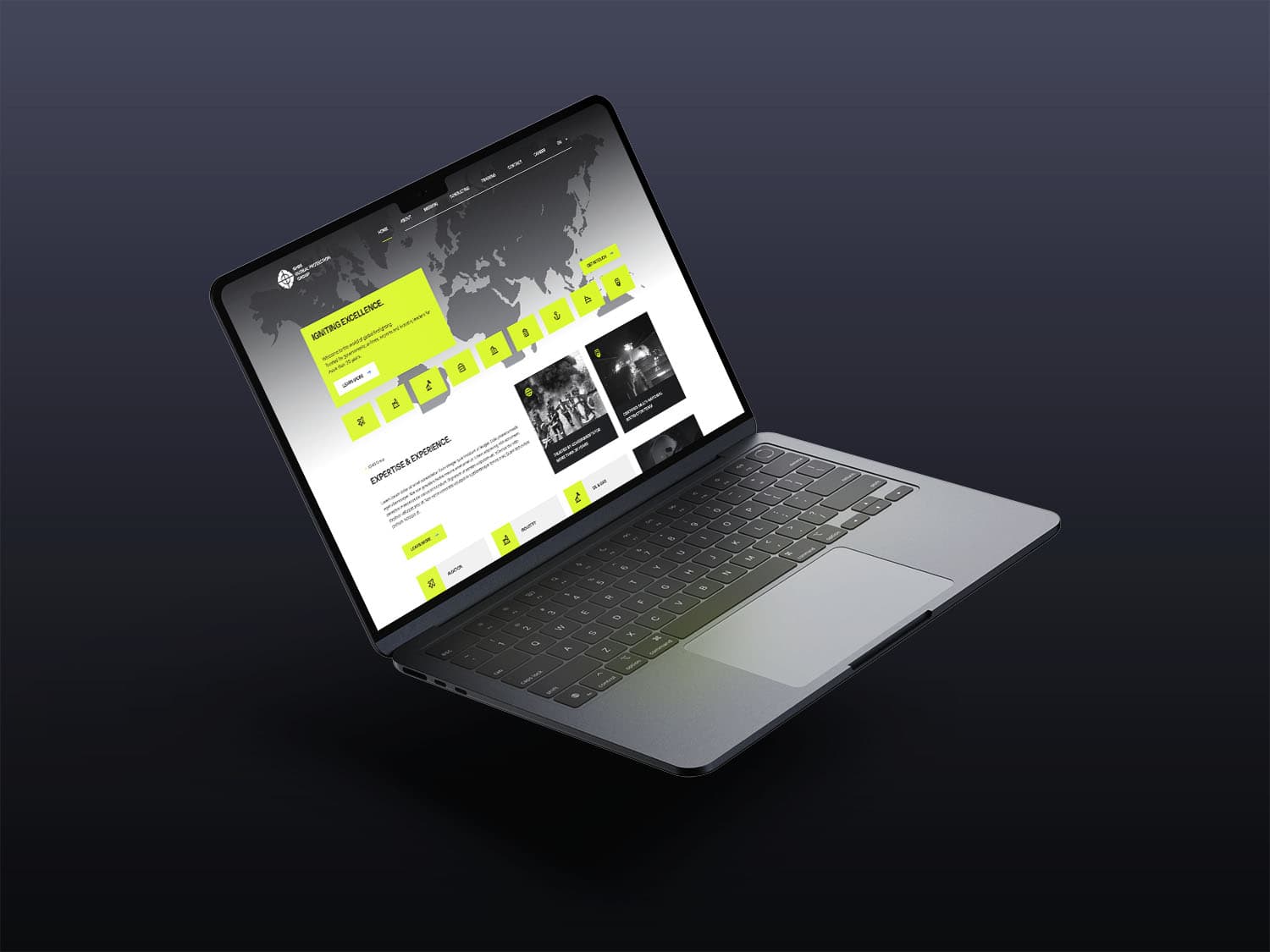
The IGNIS Group is a group of companies in the field of fire and safety training. The new brand presentation is thematically based on the high-visibility vests of fire departments and security personnel and works with a stylized Florian cross. The web design built on this presents the group's various areas of activity and serves as a first point of contact for further information and content.
Not presenting the brand in classic red tones (fire department, etc.) to stand out was an essential part of the brand presentation.
A dedicated iconography series was developed to represent the different areas of activity of IGNIS.
Designing for a group of companies is a different task from working on a single brand. As a holding company, IGNIS brings together several fields of activity in fire and safety training. For the brand work that means the frame has to be strong enough for the group to stay recognisable as one sender, and open enough for the individual fields to fit underneath without looking arbitrary.
The environment is visually crowded as well. Fire departments, fire protection and security services almost all fall back on the same signal colours. Moving through that field in classic red tones places a brand immediately, but it makes it hard to tell apart. This is exactly where the brand presentation for IGNIS started: the thematic reference had to stay readable without repeating the imagery of the sector.
In addition, brand and website came into being at the same time. Building both from scratch allows one shared logic, but it requires design decisions that hold up early.
The brand presentation takes its cue from the high visibility vests worn by fire departments and security personnel. That is a deliberate detour. The reference to the operational world stays immediately legible, while the colour scheme moves away from the red that already appears everywhere in the segment. A reference point like this holds because it is not meant symbolically. It comes from the actual equipment of the audience.
A stylised Florian cross serves as the fixed mark. It anchors the brand in its field and works as a recognisable element even where space is tight. For the different fields of activity, a dedicated iconography series was developed. In group brands, such a series does more than decorate: it makes fields distinguishable without every field needing a brand of its own.
The web design built on this presents those fields of activity and serves as a first point of contact for further information and content. The site therefore takes on an ordering role. It shows how the group is structured before it goes into detail.
An early decision is how much independence the individual fields receive. Too much of it breaks the group into separate parts, too little means prospects cannot find the field that applies to them. A system of shared colours, one fixed mark and field specific iconography holds both sides together as long as the rules behind it are clear.
Those rules have to stay usable. Setting up an iconography series also sets the terms for what a new mark has to look like when a field is added. Line weight, level of detail and pictorial logic therefore belong in writing, otherwise the series frays with the first extension.
After launch, the value of such a structure shows most in content that does not exist yet. A group that acts as a first point of contact accumulates offers, credentials and explanations over time. The brand holds when new content can be filed into the existing order without renegotiating the design every time.
Write to us or book an initial consultation directly. We reply within 24 hours, usually faster on weekdays.