
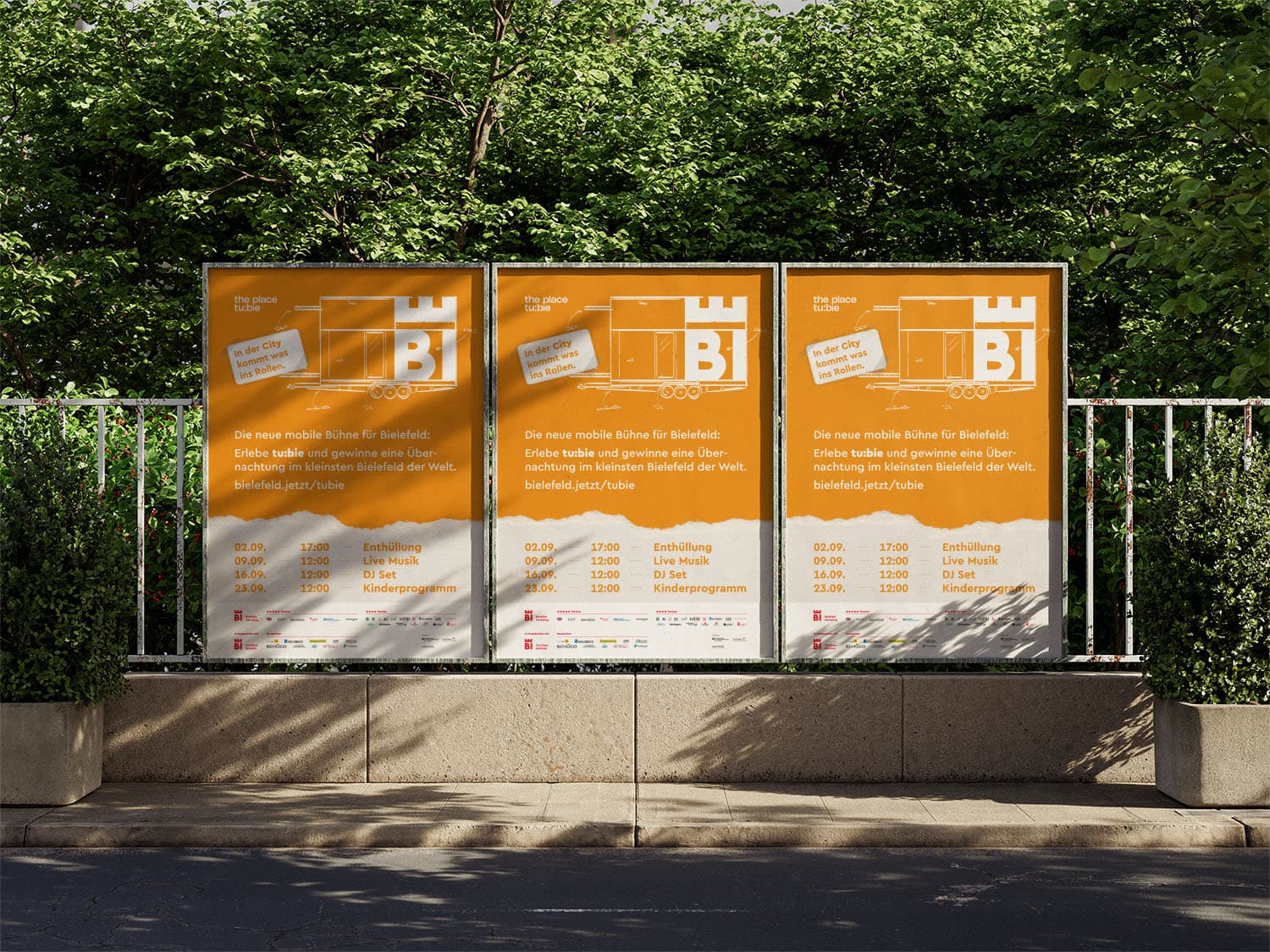
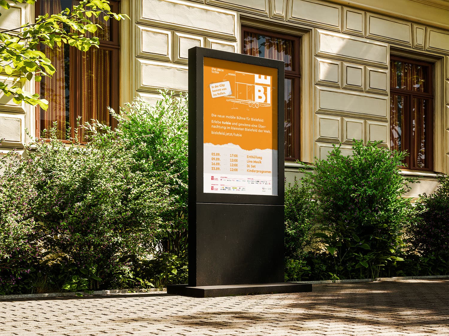
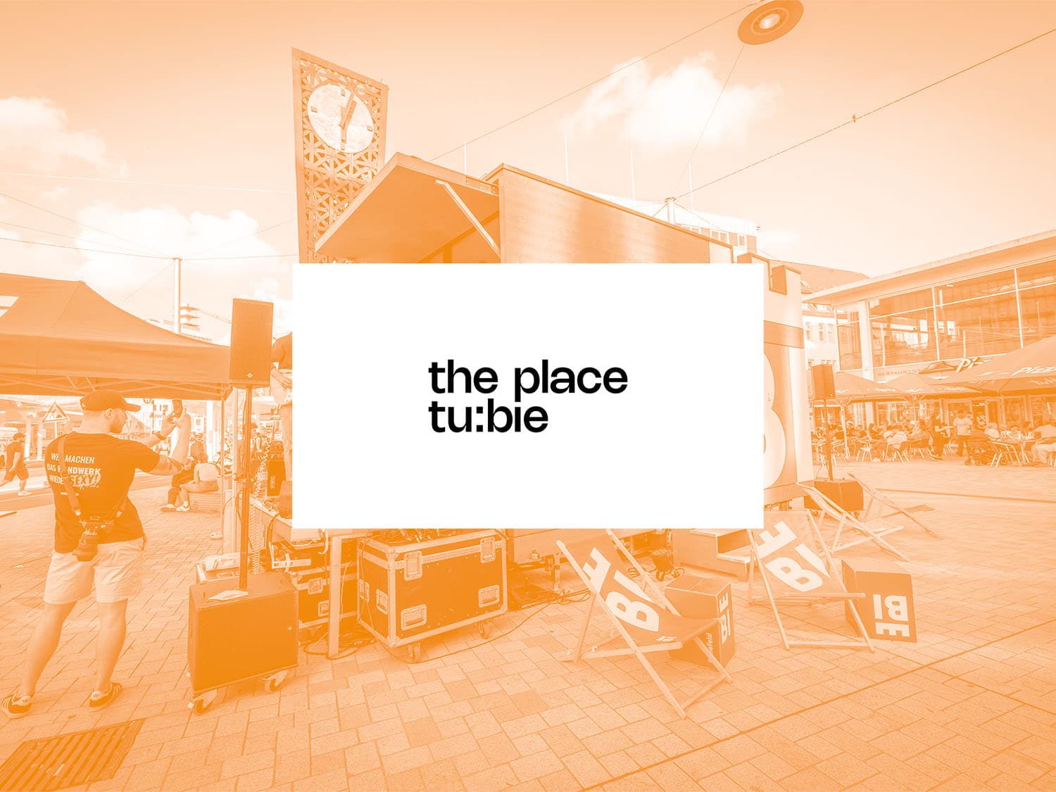
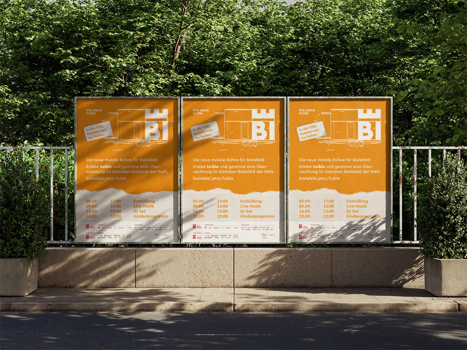
Bielefeld Marketing commissioned us to develop a small visual identity as well as online and offline media for the unveiling of the tiny house. The resulting presence ranges from postcards and social media posts to large-scale posters announcing the opening event.
To avoid revealing too much before the unveiling, we designed the silhouette of tu:bie in a sketch style for the various ad creatives.
We also created the web design for the campaign.
The task for tu:bie was an announcement, not a presence for an existing offer. Bielefeld Marketing commissioned a small visual identity along with online and offline media for the unveiling of the tiny house. Communication before a reveal faces a contradiction: it has to create attention while the object itself cannot be shown yet.
Then there is the range of media. A postcard is held in the hand, a social media post is caught while scrolling, a large scale poster is read from a distance and in motion. The same idea has to work in all three situations, although viewing distance, attention span and format have almost nothing in common.
The subject itself adds a further demand. A tiny house on wheels is a rolling stage, a mobile experience space and a meeting point at once. A campaign that shows only one of those roles narrows the object before anyone has seen it.
For the various pieces of advertising material, the silhouette of tu:bie was drawn in a sketch style. The sketch resolves the contradiction of an announcement in an economical way. The outline is specific enough to point curiosity at a concrete object, and open enough to keep material, interior and detail out of view. A text only announcement would lack that anchor, a finished photograph would have given the reveal away.
For campaigns, a silhouette also has the practical advantage of scaling. It stays legible in a small format and loses nothing on a large scale poster. One motif therefore carries across postcards, social media posts and billboards without a separate visual idea for every medium.
The web design for the campaign was created by us as well. In a setup like this, the online page is the place where the announcement can hold detail, while the offline media stay with the hint.
Timing structures the whole campaign. Before the reveal a different image logic applies than afterwards, and both phases have to be served from the same identity. Without that in mind, the day of the opening arrives with nothing to continue from, and the design work starts over.
In practice, an early question is what the smallest load bearing element is. In a visual identity of limited scope that is usually a wordmark, one motif and a short rule for colour and typography. The fewer building blocks there are, the more important it becomes that each of them works in every format, from hand held to billboard.
After the event, the question is what lives on. A mobile experience space does not stand in one place. It appears again and again at new sites and for new occasions. An identity holds when dates, programmes and places can be dropped in without a new campaign motif being needed every time.
Write to us or book an initial consultation directly. We reply within 24 hours, usually faster on weekdays.