
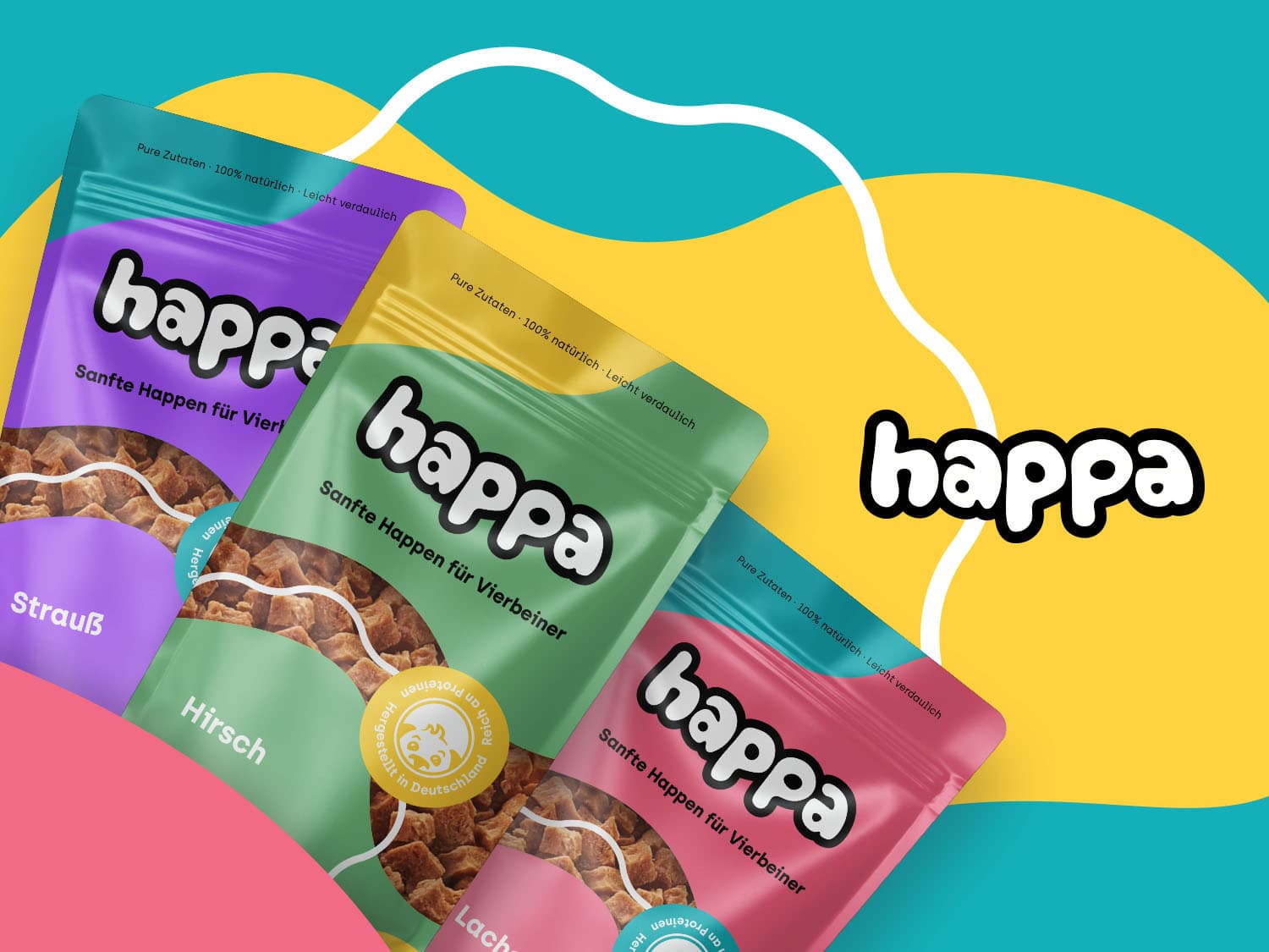
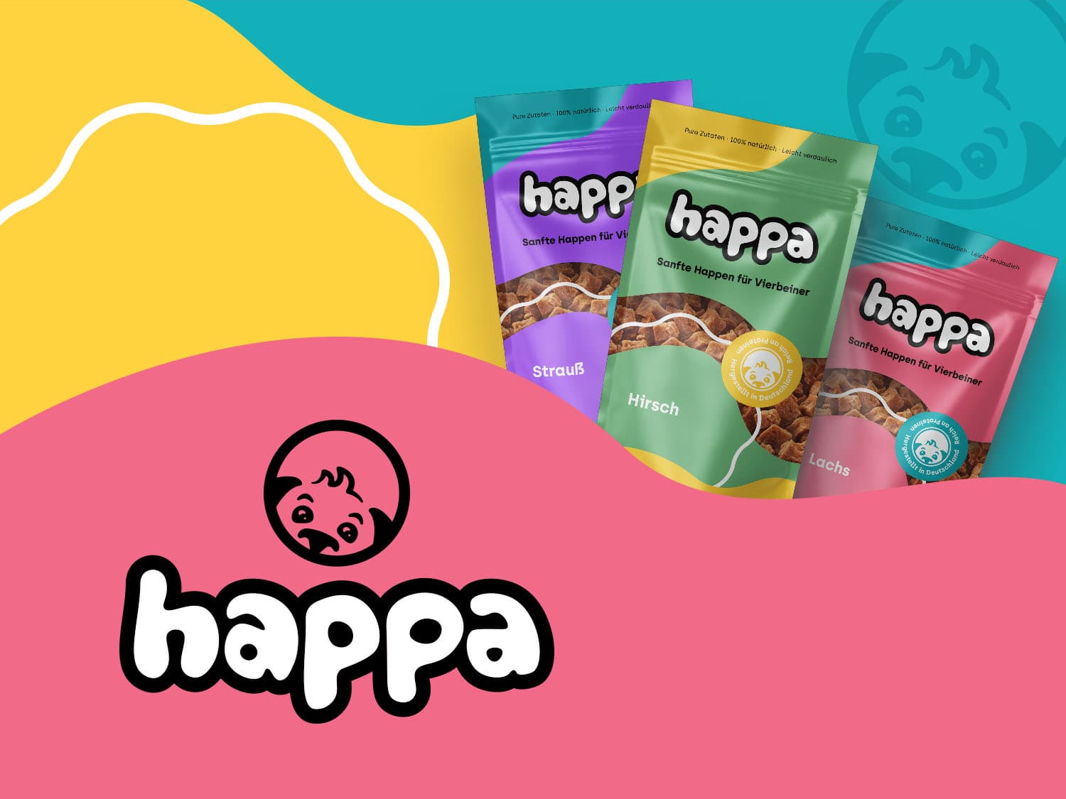
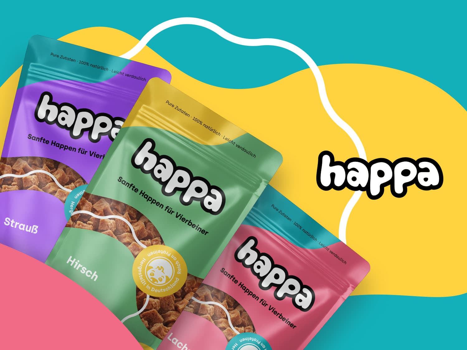
happa, a new premium provider of dog food based on natural and healthy ingredients, approached us without a name or image. Our team developed the naming and the entire visual identity of the brand.
A playful identity was created from scratch to represent happa's friendly and approachable character. The brand name is deliberately stylized in lowercase letters to further emphasize the brand's warm-hearted character.
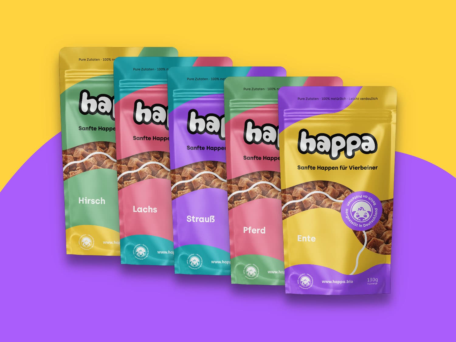
After naming, identity design and all necessary elements were created, the packaging design for each flavor as well as the display boxes were developed according to German manufacturing standards.
happa came to us without a name and without a visual identity. That means the work starts at a point where decisions have usually been made already. The name determines how people talk about the product, whether it can be pronounced and spelled, and how much room the identity will have later on.
The market for premium dog food brings a tension of its own. The purchase is made for an animal, the decision is made by a person. Providers that mainly stress the quality of the ingredients easily end up in a technical language closer to supplements than to something you hand to your dog. Providers that lean on closeness tend to lose the standard a premium product needs.
For a brand built on natural and healthy ingredients that means the appearance has to carry both: the claim made for the product and the relationship the purchase comes out of.
The identity was built from scratch as a playful one, in order to carry the friendly and approachable character of the brand. The brand name is deliberately styled in lowercase. That is not a marginal detail: lowercase audibly lowers the pitch of a wordmark and supports exactly the warmth that shapes the whole appearance.
After naming, identity design and the elements belonging to them, the packaging design for each flavour followed, along with the display boxes, developed in line with German manufacturing standards. That order has a reason. Packaging is the place where a brand becomes physical for the first time, and it forces commitments that could stay open before: how much space the name gets, how flavours are told apart, what appears in which order.
The display boxes add the shelf situation to that. There a brand does not compete with arguments but with neighbouring products in the same field of view.
A brand with several flavours needs a system for variants early on. Colour, motif, naming or a combination of them, that is best settled before the first pack is designed. Otherwise every new flavour becomes an individual solution and the range loses exactly the recognisability that carries it on the shelf.
At the same time, the production route sets the frame. Packaging is subject to requirements for mandatory information, materials and processing. Bringing design and manufacturing standards together only at the end means designing twice. The question of format and fixed areas therefore belongs at the beginning and not into final approval.
After the start, extendability decides. A young brand adds flavours, sizes and secondary placements. An identity holds when a new flavour fits into the existing rules and the appearance stays the same across packaging, display and further media.
Write to us or book an initial consultation directly. We reply within 24 hours, usually faster on weekdays.